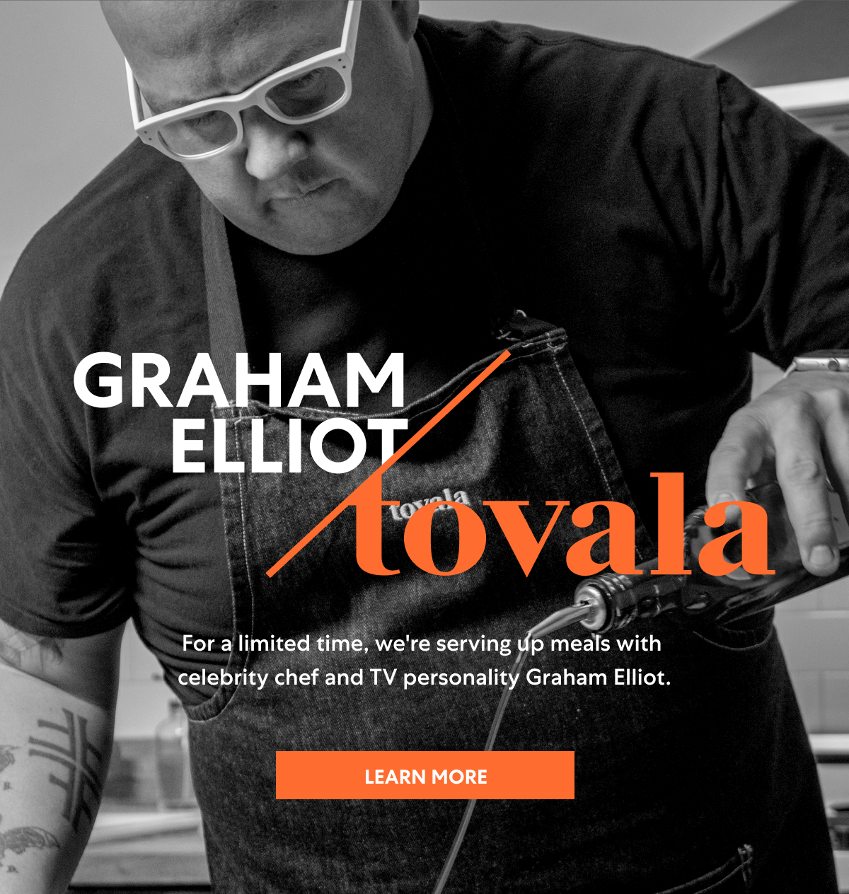


Tovala is the only service to offer their own WiFi-enabled smart oven that knows what each unique meal is and easily cooks is to perfection. While Tovala’s old brand communicated the idea of cooking, the visual identity wasn’t enough to show the true value of the brand: time saved, time well spent, time to do the things you love without sacrifice. The Tovala wordmark is a custom serif, balancing warmth and precision. The ’t’ and ‘v’ act like a knife that cuts both your food and your time, while the flat crossbars mimic tick marks in the Tovala time icon. The new visual identity is simple and clear, so that their main offering of time resonates more than just the food or oven itself. We consolidated the physical packaging to offer a simplified solution to the meal kit components and I created a color coded system to differentiate meal categories so it was easier to select, organize and distribute meals. Fresh photography and a new website was designed to complete the brand.


