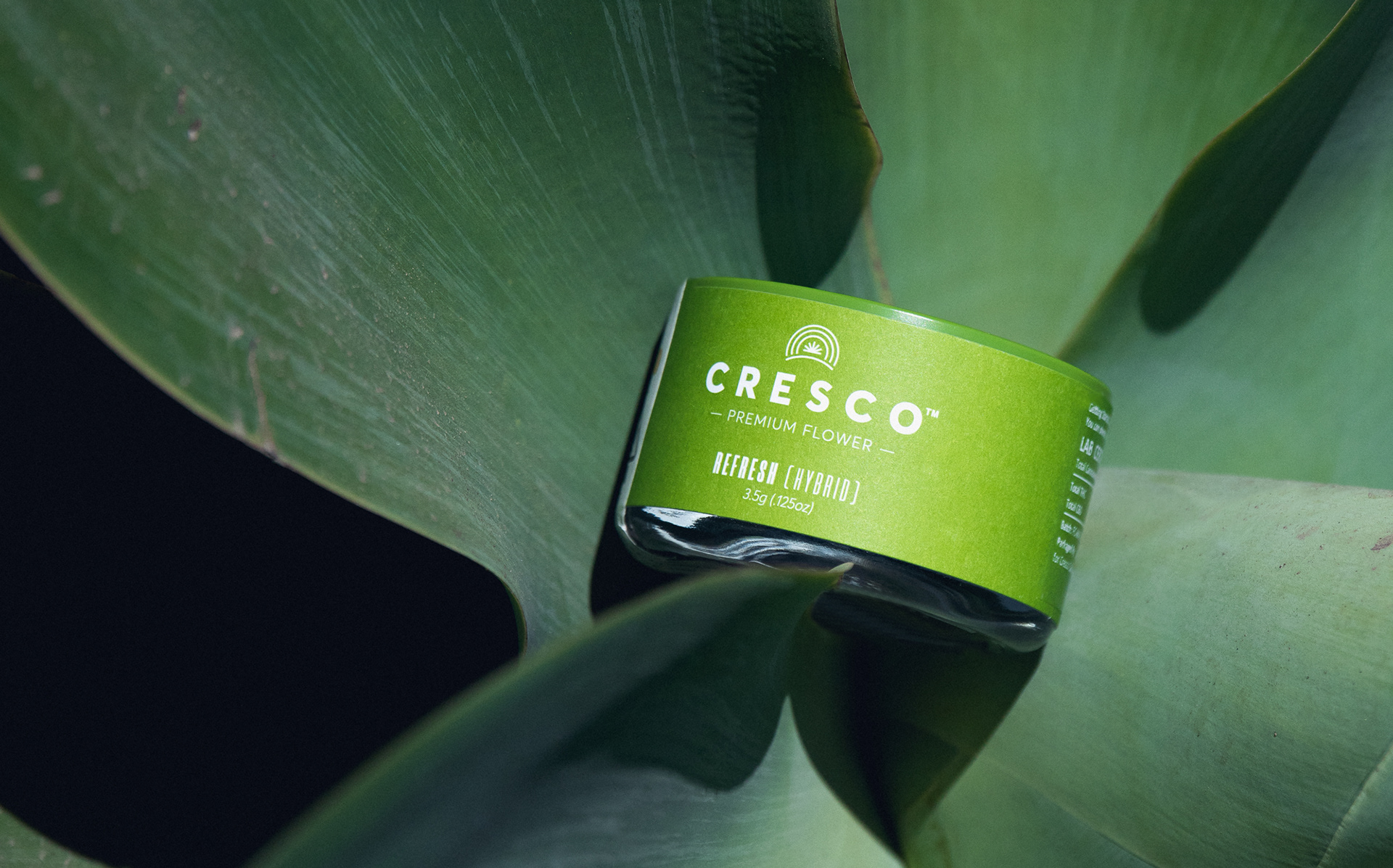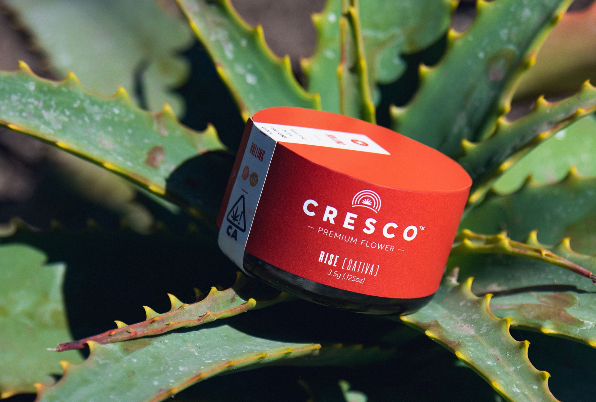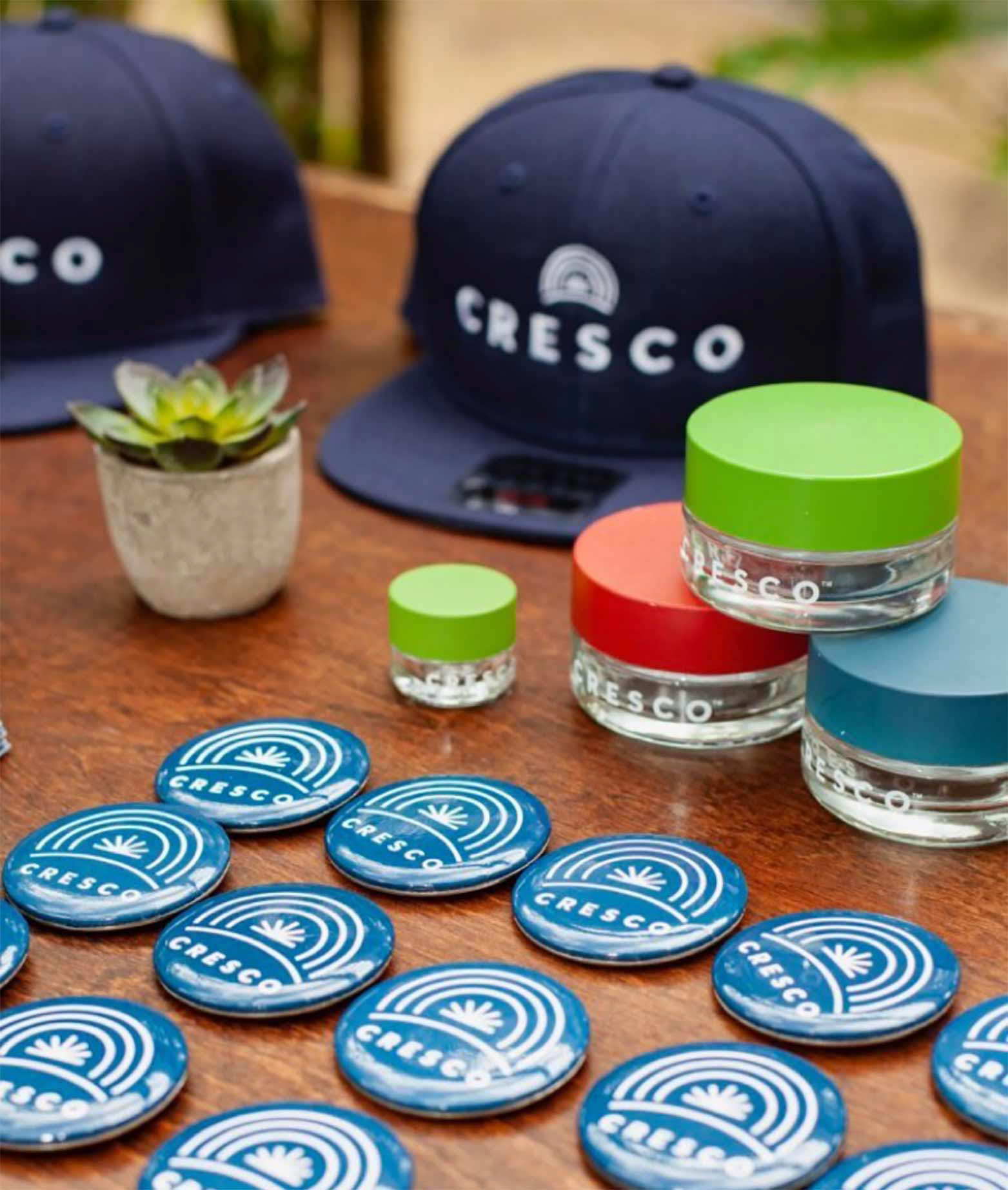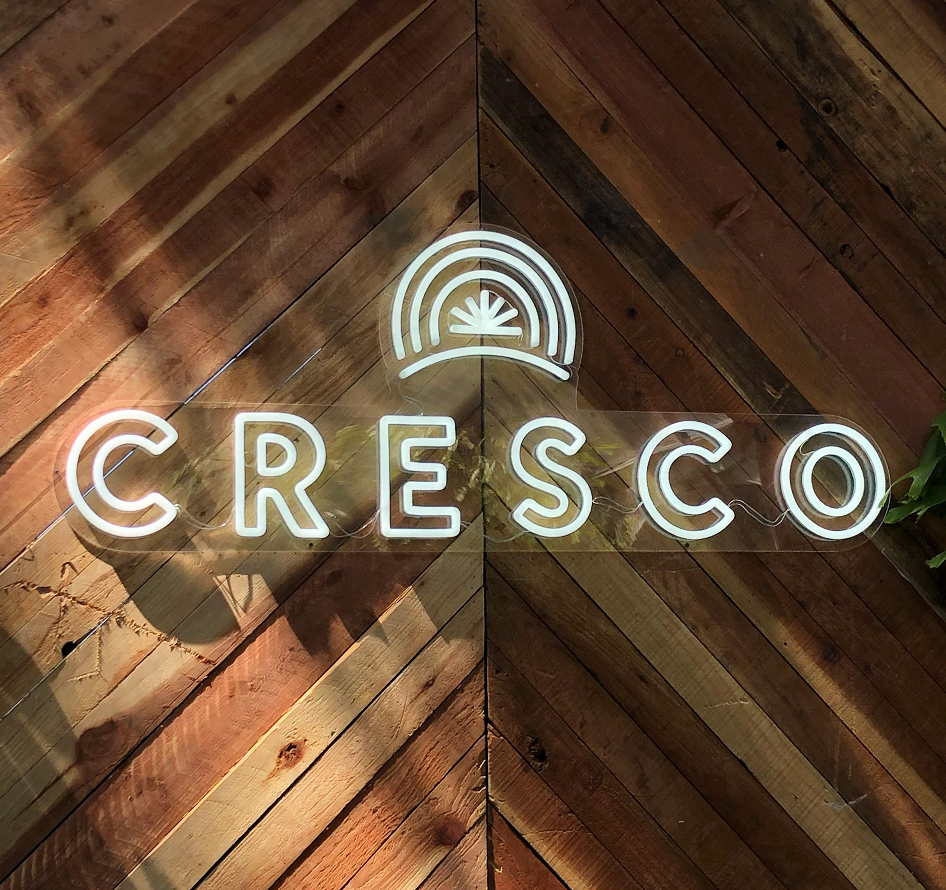


The word Cresco is Latin for ‘to grow,’ and the entire brand reflects this theme. For the Cresco flagship brand, the logo plays on the 7-pointed star of the cannabis leaf, but makes it its own in an abstract form that also parallels the sun on the horizon. Many cannabis brands don’t grow their own product, so Cresco’s brand has to highlight the holistic nature of the business and the quality of their work. The three rings of the sun represents the 30 days for which the cannabis is dry-aged. The logo feels pure, and when placed on clear packaging, the transparency allows for customers to see the quality of the product for themselves. Custom iconography educates users about the terpenes in the product – a full language for customers to clearly understand what is in their product and how it will make them feel. This iconography is repeated across brand channels to help create cohesion under the Cresco umbrella.
